Can Special Fonts Help People With Dyslexia?
- Published21 Aug 2017
- Reviewed21 Aug 2017
- Author Alexis Wnuk
- Source BrainFacts/SfN
Learning to read is no easy task. Some, like graphic designer Christian Boer, face an additional hurdle: dyslexia. As an art student, Boer began to wonder whether altering the way letters appear on a page could make reading easier. He started tinkering with typefaces for a graduation project and created the Dyslexie font in 2008.
“I never intended to do something with it other than use it for myself,” Boer says. He shared his success on a personal website and was ready to move on to other projects. Then, his web hosting company informed him they would have to charge him more to deal with a traffic spike to his site. That’s when he realized people might benefit from his work. Boer swears by the font — but can it, or any special font, help other people with dyslexia to read?
Drawing from his own experience and a small group of test users, Boer reasoned people with dyslexia — an unexpected difficulty in learning to read despite normal intelligence and vision — might struggle to read because their brains flip and rotate letters on a page, producing indecipherable strings of characters. Letters like “b” and “d” are mirror images of each other, which makes them even harder to tell apart.
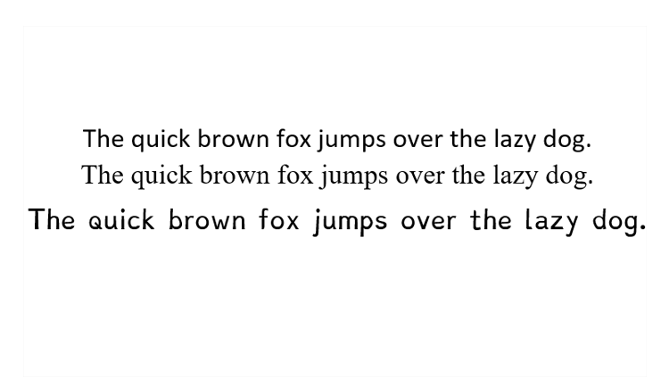
The Dyslexie font, with its unique bottom-heavy design, taller lines, and extra spacing, intends to help dyslexic readers distinguish one letter from another. By emphasizing the differences between letters, the “b” is no longer a backward “d.” As a result, it should help dyslexics read.
“It speaks to people’s imaginations that a font — especially because it looks so fancy with special letter shapes,” would help people with dyslexia read, says Eva Marinus, a cognitive scientist at Macquarie University in Sydney, Australia.
But only a very small percentage of dyslexics face problems with visual perception like mentally flipping and rotating letters. Instead, most struggle to link printed letters and words with the sounds of spoken language. Those problems are best remediated by intensive phonics training and reading instruction, Marinus says.
In 2016, Marinus led a study to test the claims behind Dyslexie. She and her research team had children with dyslexia read texts in Dyslexie and Arial fonts, and found they read faster when text was presented in Dyslexie. But, when the researchers took an Arial font and spaced the letters and words out to match Dyslexie’s spacing, children read just as quickly. They concluded that whatever benefit Dyslexie provided could be explained by its extra spacing, and not its special font style. Even then, the extra spacing produced only a modest (7 percent) improvement in reading speed.
For his part, Boer doesn’t tout Dyslexie as a cure-all. “It will definitely not help everybody,” he says.
Marinus agrees: “There are no easy fixes. It’s hard work.”
CONTENT PROVIDED BY
BrainFacts/SfN


